Responsive website concept and design
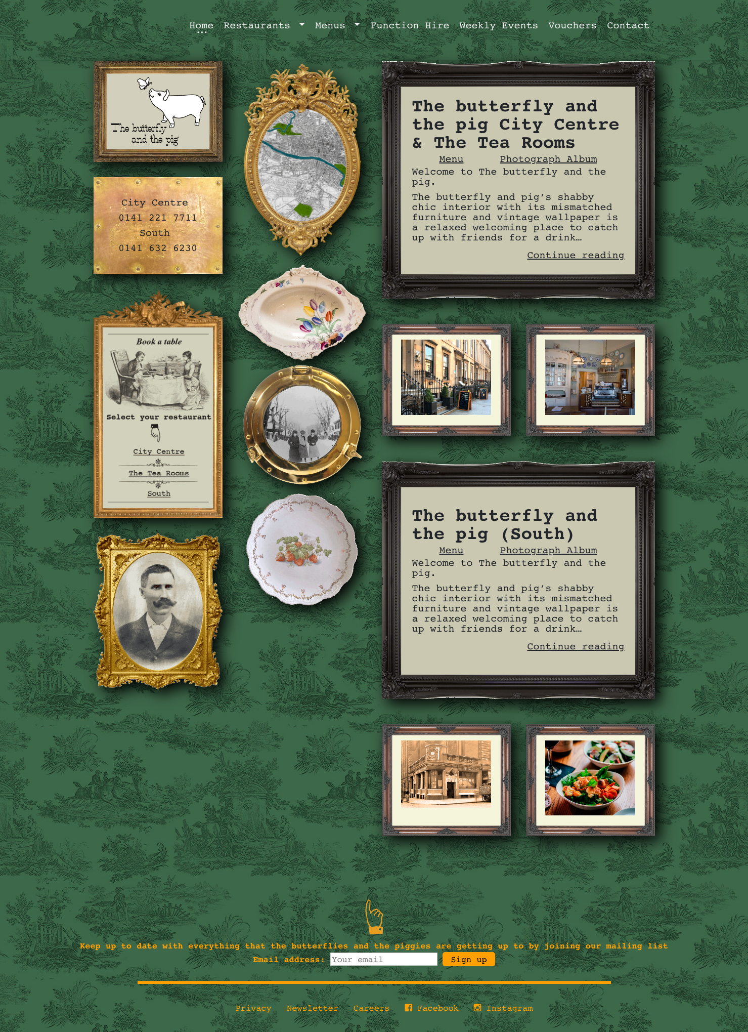
The client's brief was simple: "I want a website that doesn't look like a website."
So, we visited their restaurants; A quirky collection of paintings and pictures adorn the walls of their Victorian city centre establishment, together with a huge assortment of teapots, glasses, jugs and nicknacks.
Drawing inspiration from the unique interior design, we devised a similar approach for their Wordpress site, using a simple 4-column grid and using vintage frames to hold content to mimic their decor. Even the site background was taken from their bespoke wallpaper - photographed, edited and transformed into a seamless background tile.
Add a few animated GIFs to reinforce the quirkiness, and we created a website the client was "blown away with".
Art direction, client management, site concept, layout & asset creation.
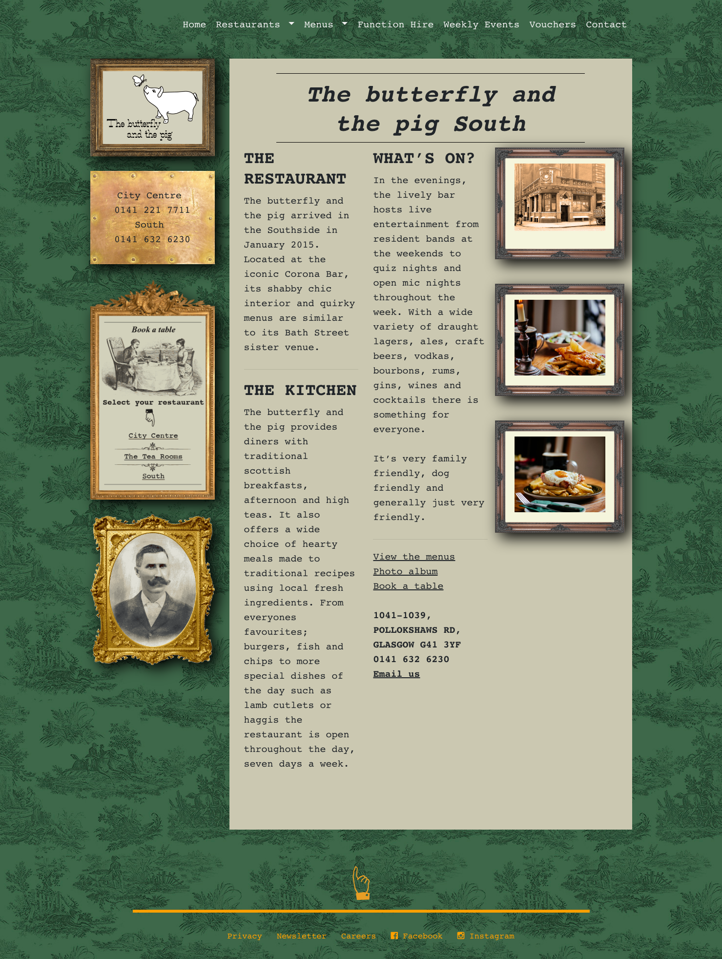
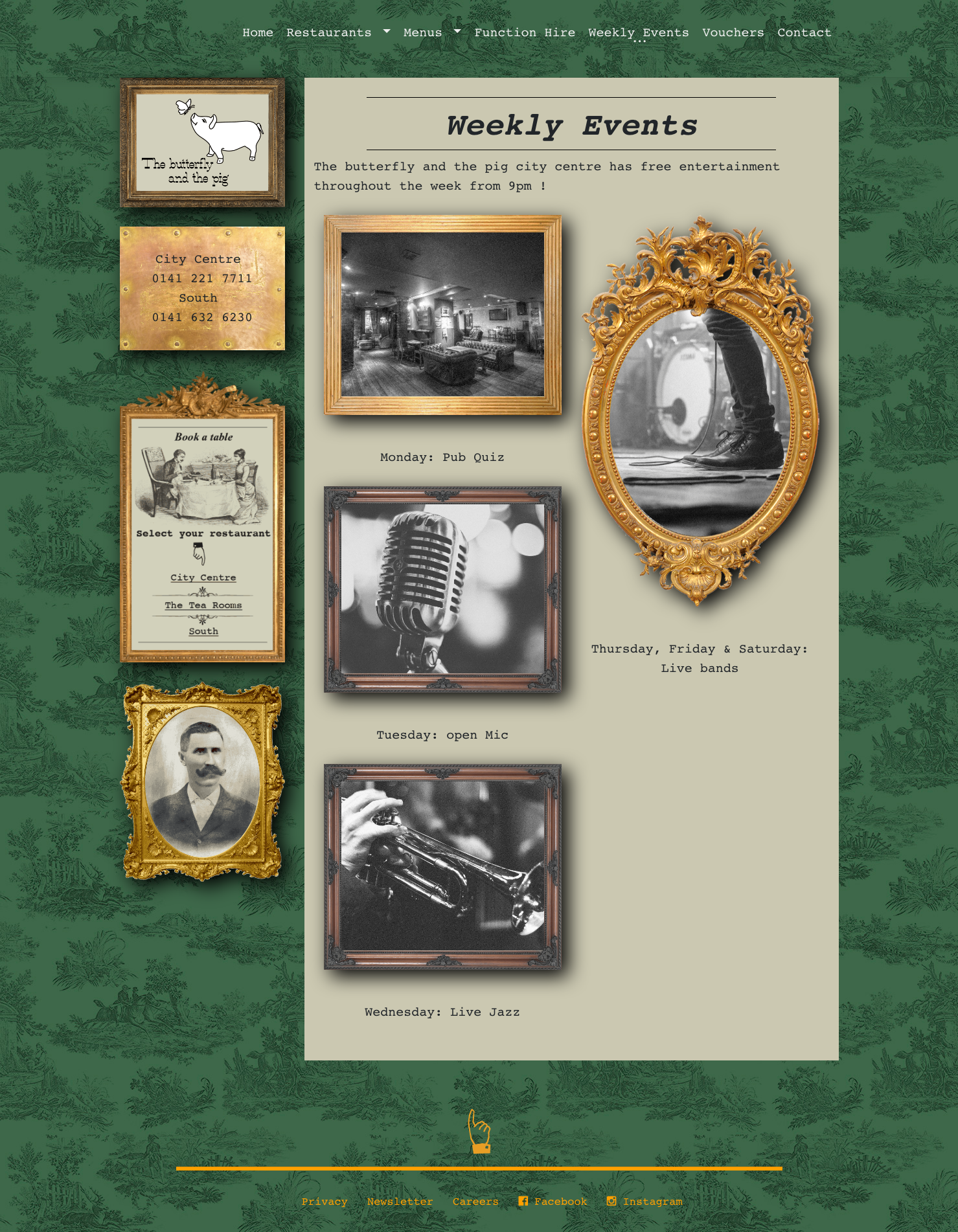

Animated GIFs to bring the site to life

